Trends in Corporate Merch: Optimize Logo Files for Print, Embroidery, and DTF in 2025
Most production delays in branded apparel come from incorrect logo files—low-resolution images, unoutlined fonts, or unmanaged colors.
Artwork errors can add days and cost overruns to EU workflows. Preparing your logo the right way accelerates delivery, protects brand consistency, and reduces reprints for urgent deadlines.
According to industry color standards, consistent file prep improves predictability across vendors.
File Formats That Printers and Embroiderers Actually Need
Use vector formats for most jobs: AI, PDF, EPS, SVG.
Raster is acceptable for photos or DTF if resolution is 300–600 DPI at final size.
Provide a clean master logo and a simplified embroidery version. Include CMYK values and spot (Pantone) references to keep colors consistent across textile printing and thread catalogs.
Convert Text to Curves and Expand Appearances
Outline all fonts to prevent substitutions in RIP software, and expand strokes/effects so lines render correctly. Keep minimum line thickness around 0.3–0.4 mm for screen printing; embroidery needs thicker elements and larger text. Avoid micro details and thin serifs—they won’t hold up on fabric or in stitching.
Color Management: CMYK, Pantone, and Thread Mapping
Specify CMYK values and Pantone spot colors for print; map Pantone to thread charts (e.g., Madeira, Gunold) for embroidery. Avoid RGB-only files which can shift on textile substrates.
According to ISO color management guidance, consistent workflows across CMYK and spot reduce cross‑vendor variance and rework.
Presets, Checklist, and Naming Conventions
Create team presets for bleed/safe areas, minimum sizes, stroke expansion, DPI, and naming.
Example: brand_Logo_CMYK_Pantone.ai
Use a preflight checklist: vectors, curves, color specs, dimensions, mockup placement, and technology selection (DTF, screen printing, embroidery). This reduces the “wrong file” bottleneck and speeds approvals for urgent orders and events.
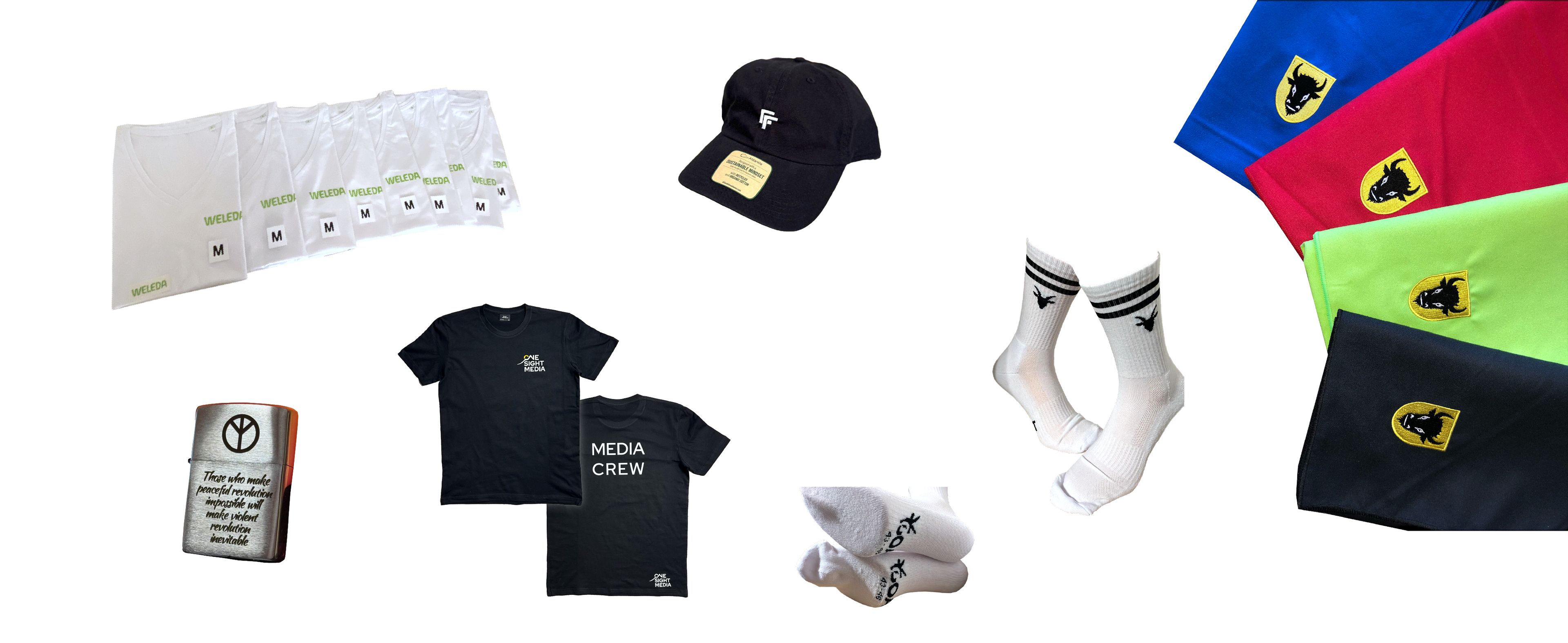
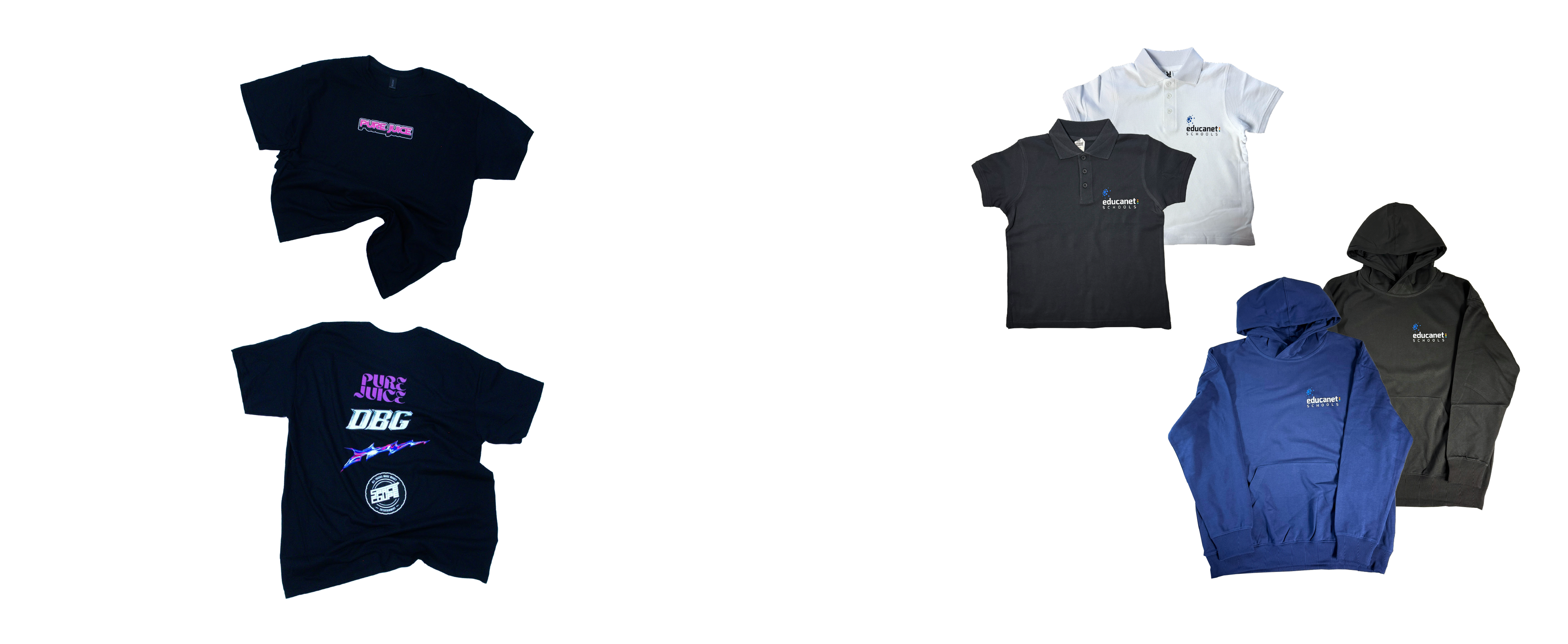
See photo references and technologies: Reference & Technology ↗.
Common Graphic Mistakes to Avoid
- Low‑res PNGs scaled up, mistaken for production-ready art.
- Un-outlined fonts causing layout changes on different systems.
- RGB gradients sent for CMYK print, resulting in color shifts.
- Overly complex embroidery that loses detail in threads.
- Ignoring heat press margins and minimum sizes on apparel.
These errors increase cost and lead time—fix them up front to maintain brand consistency and meet deadlines.
What Now?
EU-based teams needing reliable Czech production with photo references and local quality checks can explore fast turnarounds for 1–3 weeks—ideal for marketing, sales, HR, and event deadlines.
👉 Book your FREE consultation today or contact us:

Frequently Asked Questions
What logo file format is best for textile printing in B2B workflows?
Vector formats like AI, PDF, EPS, or SVG; use 300–600 DPI raster only for photos/DTF.
How should I prepare fonts in my logo for production?
Always convert text to curves and expand strokes/effects to avoid substitutions.
What colors should I provide for consistent EU production results?
Include CMYK values and Pantone references; map Pantone to thread charts for embroidery.
What resolution do I need for raster prints on apparel?
Minimum 300 DPI at final size; 600 DPI is preferred for fine details and DTF.
Can gradients be embroidered successfully for corporate logos?
Gradients don’t embroider well; simplify to solid areas and clear contrast.
What are typical minimum line thicknesses for screen printing and embroidery?
Screen printing ~0.3–0.4 mm; embroidery requires thicker elements and larger text.
How do I avoid delays for urgent branded apparel orders?
Send correct vectors, outlined fonts, color specs, dimensions, placement mockups, and technology selection.
What’s the difference between DTF and screen printing for company merchandise?
DTF handles full‑color and gradients quickly; screen printing excels at solid spot colors and durability.


